CAPTURING THE BLUES – PANTONE ANNOUNCED THE COLOUR OF 2020
30/12/2019 2021-01-20 5:27CAPTURING THE BLUES – PANTONE ANNOUNCED THE COLOUR OF 2020
CAPTURING THE BLUES – PANTONE ANNOUNCED THE COLOUR OF 2020
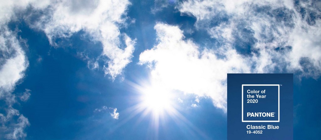
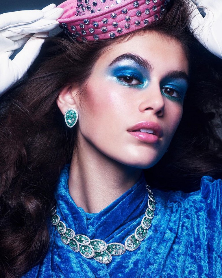
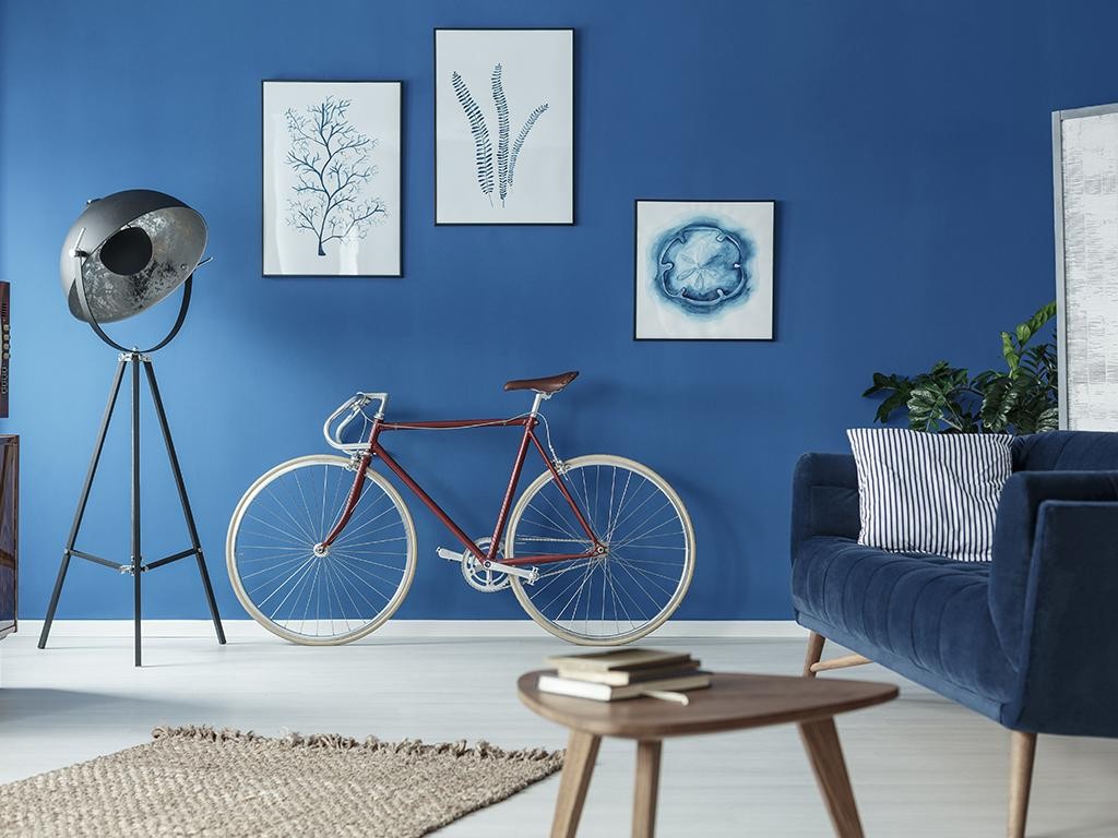
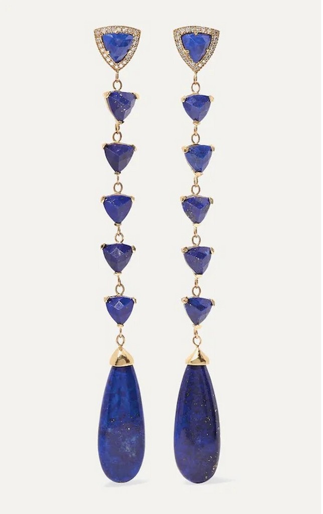
Timeless classics exude elegance and are a source of reliability. Every year design organizations wait with bated breath for the unveiling of the colour of the year by Pantone to create their design stories for the new season. Pantone’s colour of the year 2020 was recently unveiled as – Classic Blue (PANTONE 19-4052), a timeless colour that is reminiscent of the sky at dusk.

The colour blue often evokes feelings of calmness, concentration, balance, peace, tranquility, security, orderliness and other feelings of trust. The soothing, reliability and positive effect of the colour helps many brands gain customer loyalty and is used in their logos.
In the year 2000, Pantone had chosen Cerulean to mark the beginning of a millennium, as it reflected the colour of a morning sky which symbolizes the beginning of a new day.It may be considered as borderline boring, however, after 20 years, the chaos and turmoil across the globe influenced Pantone to choose a colour that instills the feeling of protection and serenity with the beginning of a new decade.

The term “classic” refers to something basic or traditional which indicates that we have to use our basic concepts in order to create something unique in the future. While, Blue is often used to show some form of development and something futuristic.
Therefore, the colour – Classic Blue helps us think in a creative way while keeping us grounded.


Blog by: Akshayaa. A
B.Sc. Fashion and Apparel Design
Batch A 2018


